happy friday! i'm back with another edition of my why this works series! -- an attempt to break down crazy print combinations that shouldn't go together, and share my favorite tricks behind why they do.
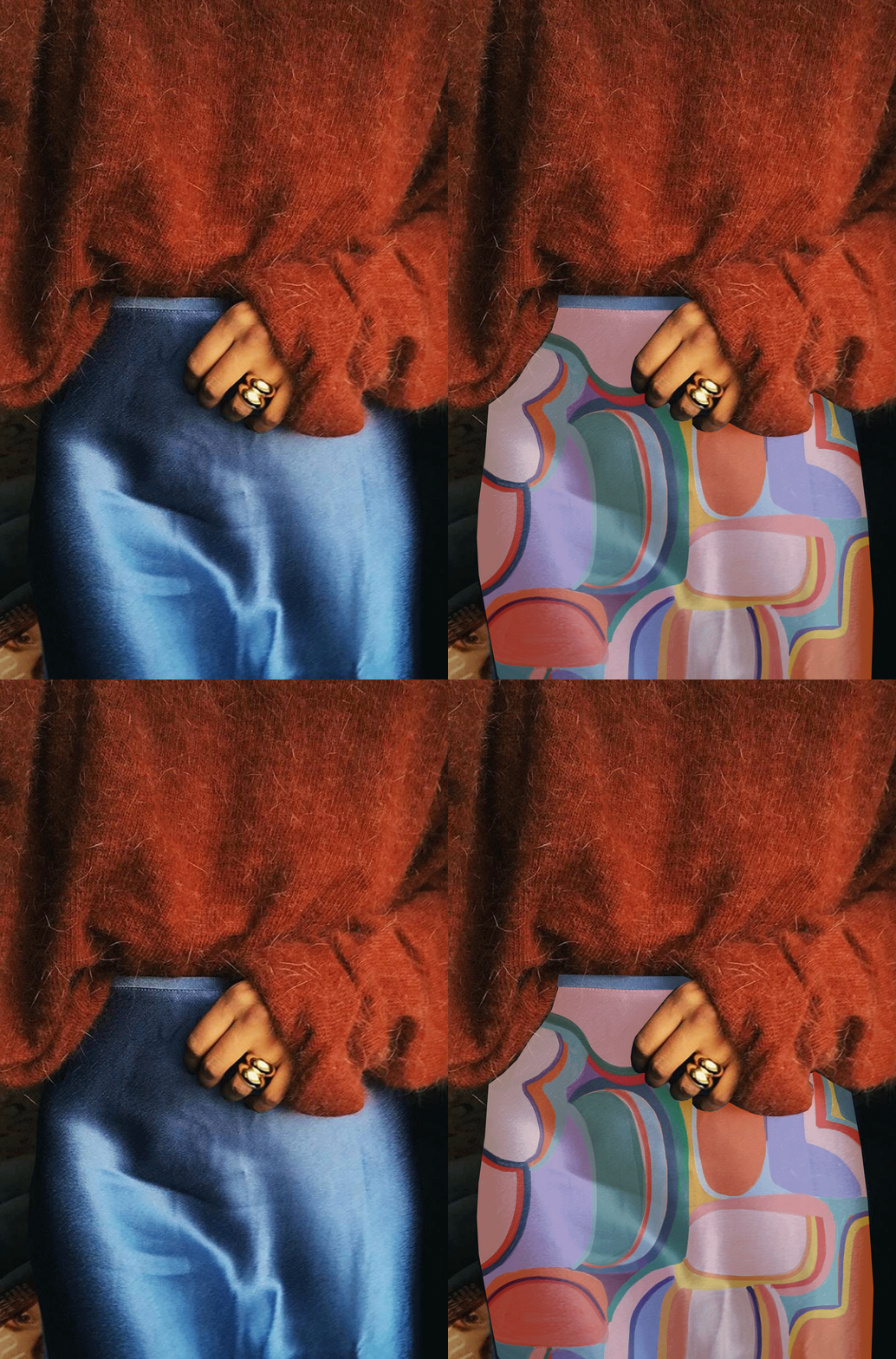
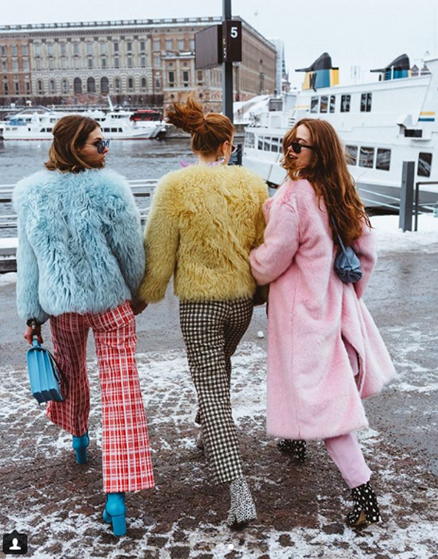
so let's talk about this gal's outfit: i was immediately drawn to her amazing people-print coat for obvious reasons -- good colors, classic shape, teddy texture, seriously cool pattern. this outfit is also great example of why pairing a large scale print with a smaller style will always look good. there are so many ways you can wear this coat, but instead of throwing on a white dress or jeans (although both would look amazing) consider something unexpected: a long yellow dress covered in dainty florals with a quirky striped basket clutch for example. the trick is playing with scale -- a large print will naturally steal your eye's focus allowing the smaller print to blend into the background. i always look for similar or complementary colors and a distinct difference in pattern size to make sure everything feels cohesive.
scroll down for more print mixing secrets hiding in this outfit!

+ this coat has a classic shape which helps this loud print feel not so loud -- stick to silhouettes you know and feel comfortable in.
+ long simple layers create a long and lean look that won't compete with head to toe pattern mixing.
+ when using two different pattern sizes in one look, be mindful of color and difference in size.
+ pay attention to content -- florals are a pattern neutral and are easy to mix with trendier prints like the one found on this coat.
+ don't shy away from playing with accessories in clashing prints (especially bags or shoes!), it's a low commitment way to experiment.
+ when wearing a lot of patterns you need a place for your eye to rest. i like to stick with simple makeup and hair, like a fresh face and a low bun.
original photo / via we what wear
